Today I finished the painting Of Venus I was working on recently. It has taken me more time than expected for the reason that Im working on various projects simultaneously. I find this custom quite fit for my style, that is the style of the Baroque and late Renaissance old masters, which involved the application of layers of transparent paint called glazes. If you are like me you might find it quite tedious and boring to be working for a month on a single painting. This has now become an average completion time for me. Instead I have about 5 paintings sitting around and work on a different piece each day. This enables me to keep unity on color and technique in the body of work and also retains my interest in a single work for a longer time. It wasn't like that when I used to work in an expressionist manner and with acrylics. The painting process has slowly evolved over the years and I have refined my techniques by implementing self discipline and an established working method that is inspired on the work of old masters such as Rubens and Titian. I believe we have many advantages over these masters from the past and we should take advantage of all of these tools at our disposal. For instance the use of Photoshop just makes my work so much easier and less time consuming. Also having access to an excellent archive of reference material from good photographed material to reproductions of the old masters at high res that I view from my Computer monitor. Technology is a very helpful ally at my studio and I use it in every way I can. Allow me to illustrate in simple terms my working process: Here's a perfect example for it
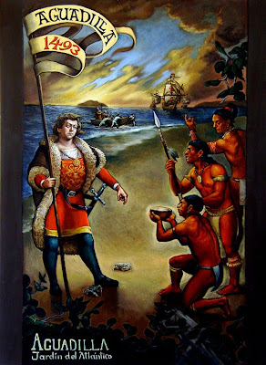
Recently I received a commission to redesign a public mural project for a library building in my hometown of Aguadilla. The municipality already had a design but were not pleased by it and asked me to improve itHere's the image that I had to work on.
I usually would not agree to work upon the design of someone else. I respect the artists vision, but I had to make an exception on this one. It was quite evident that the original design presented to me had some serious flaws that needed to be fixed or even replaced all together. Since the building had windows and there were certain limitations like nearby buildings that would obstruct vision I had to take all of these facts in consideration plus try to preserve the main characters position within the composition. So the first thing I did was draw, draw and draw. Then scan some of my drawings and prepare a preliminary Photoshop montage. Here's how it looked like inicially:
After this I then started to work on my next filter; Creating a poster size preliminary drawing that would serve as my starting point placing all of my characters in place and rethinking the composition without dealing yet with color, just position the on things and the spacial relationships. Here's what came out of it:
Here the elements and characters are much more clear and sent this version first in order make sure it suited the purpose and was approved by the municipal committee. They suggested a few changes and I suggested some more. This is the time to make those changes and make sure everyone is happy with the design before moving on to the next stage: The Painting

Too bad the photograph I took does not make much justice to the work, I must confess I still need some good photography lessons to learn. It came out too dark but there it is. Here's the final design after going through several filters. I think this is the word that should stick out and be learned from this and its the word: Filter. The more you filter ideas, concepts, and even techniques, the better result you will end up with. Filters come in many forms. A filter can be a gesture drawing or a collage. The more you explore an idea or composition, the more you learn from it and the better you will get at it. Of course I dont normally go on trying to please a client when I paint. I paint for my own pleasure and with my own set of goals and convictions in mind and don't have an assigned committee telling me what to paint and what should I take out or add. But its good to think about having an evaluating committee in order to guarantee good results. So why don't we imagine one for a moment and imagine that each filter of step of the process is a member. The more filters or steps you add to the process (lets say a Photoshop montage, a drawing, a few other sketches) the more imaginary members you are adding to your committee. Any work of art in which you have spent a good deal of time in the creative process itself, will bear fruit and the results will talk for themselves. On my next Blog Ill post a picture of my latest painting "Long Live Venus" and explain in detail the techniques I have used for this particular painting.


No comments:
Post a Comment